Note to self: Egg tempera recipe http://www.ehow.com/how_2126271_make-egg-tempera-paint.html
Techniques
Artists
All techniques taken from (http://www.crayola.com/educators/techniques/tempera_paint.cfm)
Technique 1
Hard edge - use a flat edged brush with a lot of paint to create a sort of 'barrier' around the area you're painting, which prevents colors from blending
If paint is watery this is good to keep my colors from mixing or leaking, especially since my paper is up on a wall.

Technique 2
Pressure variations - make changes in the line width by pressing on the brush mid-way through stroke
I thought I might use this technique on some seaweed in my picture.

Technique 3
Double colors - dip the brush in a different color on each side
This technique can be used when adding value

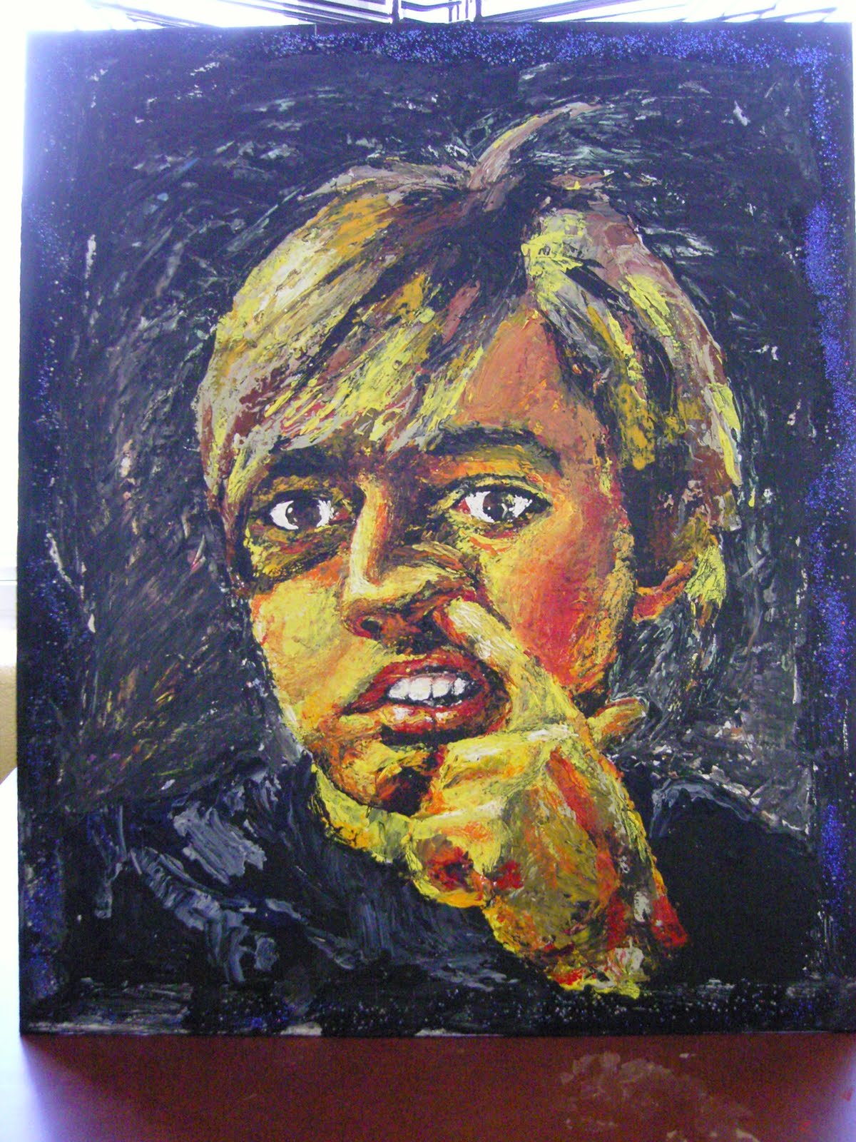
Artist 1
Marina Petro
I chose this artist because of her varied lines and vibrant colors

Artist 2
I chose this artist because of the great detail and glowing sort of softness to those details

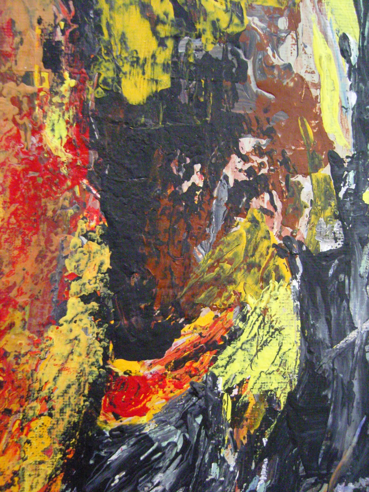
Inspired by:
I love the colors in this picture, they're very interesting.
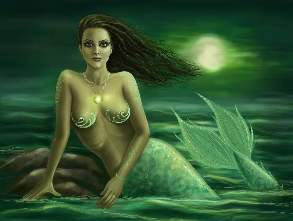
Deviantart > Estele

I love how natural and lively this picture looks.
Deviantart > Peggy77